ShopDreamUp AI ArtDreamUp
Deviation Actions

Printable Holiday cards
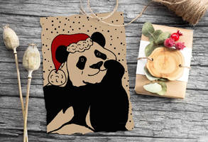
Printable cards (for example Christmas cards) made with digital goop pen. Just print and write text.
Large size (over 3000px) JPG with background , PNG without background.
For personal use.
$1/month
Suggested Deviants
Suggested Collections
You Might Like…
Featured in Groups
Description
I used my own picture as reference for this drawing. The colors were a bit tricky but I think it came out pretty cool. The drink is Chocolate Java Chip and next to it there is a cake pop. (Thanks Lizzy for getting me my favorite drink!  )
)
I used a program called Corel Painter Essencials 4 and I used my own mouse as a drawing tool.
IF YOU WANT TO USE IT LET ME KNOW AND PLEASEEEEE GIVE ME CREDIT!! THANKS!!!
All the copyrights go to Starbucks since its their logo
I used a program called Corel Painter Essencials 4 and I used my own mouse as a drawing tool.
IF YOU WANT TO USE IT LET ME KNOW AND PLEASEEEEE GIVE ME CREDIT!! THANKS!!!
All the copyrights go to Starbucks since its their logo
Image size
607x800px 76.79 KB
© 2013 - 2024 ChantalGalvan
Comments2
Join the community to add your comment. Already a deviant? Log In
First of all if you used a mouse AS a drawing tool, freehand this is a pretty amazing piece, Like those people who draw The Mona Lisa with an etch a sketch.
My first reaction when I saw this was that it looked like a card, I like the idea of people sending Starbuck's cards as get well or to mark special occasion. "Get well soon so you can go to Starbuck's!" OR "Christmas Just got Merrier" It just made me happy.
ANYWAY The colors are great The composition is excellent. Sometimes placement of just a few objects is more difficult to get right than if you have many objects. I like that you chose to let things run off the edges of the page, I am always more intrigued when I am brought closer into a space. I know what the end of a straw looks like and if I have forgotten what the corner of the logo looks like, well its right there on the cup to remind me. I do not mind the few places where the lines look a bit jagged or rough, as a matter of fact I think it adds to the piece, I get very tired of all the over polished work out there where perfection becomes more important than what anybody has to say or any emotions that are evoked. Its just raw enough to avoid that while still being technically very good.
I gave 4.5 for originality only because well its Starbucks. I had a 4.5 for impact as well for the same reason then realized that for a Starbucks piece it had a pretty big impact, so I put it in its place and gave it a 5. Nice piece


